"Signs" of safety
Have you ever visited a shopping center, office building or auditorium for the first time and found that the signs were too small, hard to read or obstructed from view? Have you ever thought about what could happen if there was an emergency at your own place of business and the signs were the only direction you had to get to safety? General chaos and possible injury or even death could become a reality.
In any office, commercial, public or residential building, or workplace in general — whether completed or under construction — clear, informative signs are essential for conveying directional, instructional, safety or general information to its inhabitants. In industrial or manufacturing facilities, signs are absolutely vital and required by law.
Clear and consistent
Using a clear and consistent standard for signage throughout the workplace is key. By developing safety signage procedures that are consistently applied and clearly communicated, you can make your facility or workplace safer, increase productivity and profitability. The correct signage also promotes increased safety practices, fewer mistakes, and reduced maintenance and insurance costs.
There are a variety of factors for facility or worksite managers to consider when trying to clearly communicate the correct messages. Familiarization with OSHA specifications is important, even when considering a simple sign. Managers should look at signs already in place and determine if they follow some basic tips for creating effective signs. But first and foremost, be sure that your facility or workplace has the basic required signs from OSHA in place.
In order to communicate successfully, signs should be highly visible and attractive. To make the most of your signs and graphics, keep in mind the four techniques for effective design: visibility, readability, noticeability and legibility.
A sign must be seen — visibility. To do its job, a sign should be highly visible. Make sure that the sign’s lettering is clearly distinguishable from its surroundings. Color choices and graphic elements can help the sign stand out from background clutter that might distract the viewer’s attention. Maximize the sign by adding a border. A border focuses attention on the sign and helps the viewer read it 26 percent faster, according to research done by the Pennsylvania College of Optometry. Also, consider displaying special information in a second color, which increases the reader’s retention by 78 percent.
Send a clear message — readability. If your sign will be viewed from a distance, choose a typestyle with strong, simple strokes that is easy to read. If distance isn’t a factor, more options are open to you, but sign experts generally advise against very convoluted scripts and heavily ornamented typestyles, which can be difficult to read even up close. A good compromise might be to use a novelty typestyle on a key word or initial as a focal point, then switch to a simpler, more readable style for the rest of the text.
Show your true colors — noticeability. Color is another powerful message-enhancer. If your company has an established color theme, you can carry those colors through on all your signage to reinforce your image, identity and noticeability.
Today’s advanced technology makes it possible to generate photos and artwork as large as you like and apply them to almost anything you want. The computer-based full-color technique can be used to reproduce existing art or create custom graphics for use on a wide variety of signage materials. Depending on the requirements of the project, results can range from glossy photo-style prints to backlit transparencies to adhesive-backed decals for windows, walls, floors and vehicles.
Provide enough contrast — legibility. Whatever colors you prefer, make sure they provide sufficient contrast to make your sign easily legible. Because the eye perceives colors differently in natural light, incandescent, fluorescent, halogen and other types of illumination, you’ll want to view your selections under all lighting conditions that may occur at your site.
What your signs say about you
Effective signs and graphics can reflect a good image for your business or facility, while poorly designed signs are more likely to be overlooked by workers or even turn potential customers away.
With so many different options available, selecting even a simple sign or graphic can be overwhelming. If you are in need of updates or even a complete signage makeover, consider these questions:
- What kind of image should the sign or graphic portray — trendy or elegant, classic or modern?
- What will the sign or signs be used for — temporary or permanent, indoors or outdoors?
- How will it be installed?
- What is the budget?
- If outside, what kind of elements will the sign be exposed to?
- How long will the sign or graphic be used?
- What is the viewing distance for the sign and the length of time it will take for viewers to read it?
- Are there any permits required or restrictions imposed on the sign?
When safety is at the forefront of everyone’s mind, then productivity will flourish and so will your business.
SIDEBAR: OSHA Requirements
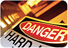
OSHA has a complete listing of general signs and symbols that are required to be visible at all times when work is being performed. Following are some of the signs and their requirements. For more detailed information, visit www.osha.gov.Danger signs — Used only where an immediate hazard exists. Danger signs have red as the predominating color for the upper panel; black outline on the borders; and a white lower panel for additional sign wording.
Caution signs — Caution signs warn against potential hazards or unsafe practices. Caution signs have yellow as the predominating color, black upper panel and borders with yellow lettering.
Exit signs — Exit signs contain red letters, not less than six inches high, on a white field.
Safety instruction signs — Safety instruction signs are white with green upper panel and white letters to convey the principal message.
Directional signs — Directional signs, other than automotive traffic signs, shall be white with a black panel and a white directional symbol.
Looking for a reprint of this article?
From high-res PDFs to custom plaques, order your copy today!