A NIOSH Science Blog post
Illustrating the point: Choosing the right ART for the message
By Amy Filko, Pietra Check, Mike Flynn, Nura Sadeghpou
If you wanted to deliver a series of public health messages to people gathered at a busy Consulate (think Saturday at the DMV), or at another trusted community organization, how would you do it?
We investigated the answer to that question specifically for a Spanish-speaking immigrant worker population, and specifically for conveying information designed to prevent work-related injury, illness, and death. The result of this process is a multi-faceted project that includes 1) a partnership with the Mexican Consulates and the Ventanillas de Salud and 2) the creation of illustrated educational materials for workers including four brochures, two posters, and five videos: Protéjase.
The first blog of this series described the content and utility of the Protéjase materials. In future blogs we will describe other key elements of this project, including the qualitative process we used to test our imagery with the community and the role and rationale of the NIOSH partnership with the U.S. Mexican Consulates, whose infrastructure has expanded to improve the health and well-being of their population, reaching the largest Spanish-speaking immigrant population in the country. This blog is about a small but vital part of this project—choosing the right kind of art for the educational materials.
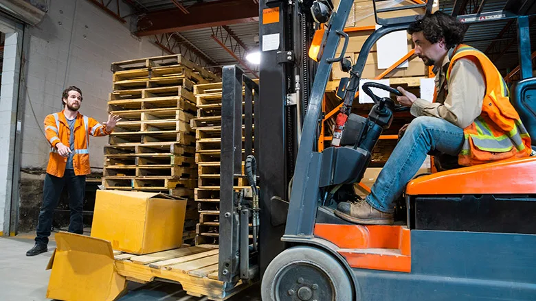
The educational materials we created follow both fictional and real characters as they navigate a series of workplace risks. Our key message is: “Return home from work safely and with dignity.” We wanted our audience to know that help is available, so we developed the following call to action: “If you are worried, go to one of the many organizations that can help immigrants get information and services related to staying safe and healthy at work.”
Should we invest in good visuals?
To create these materials we asked...Click here to read the rest of the blog post and see the illustrations referenced.
Looking for a reprint of this article?
From high-res PDFs to custom plaques, order your copy today!