Safety Analytics
Data does not speak for itself: You have to speak for it

The data “will speak for itself.” If you have spent any time in the data analytics world you have heard this phrase thrown around. But is it true? Often the people who say the data will speak for itself are the ones who are closest to the data. For them it might be true. EHS analyst, business analysts, and other disciplines that focus their daily efforts on data collection, cleaning, preparation, and analysis are closest to the data. However, for employees of departments whose focus is not data analysis, the data can look like it is speaking Italian instead of English.
Do you speak Sabermetrics?
Let’s look at an example from America’s pastime, baseball. I am an avid baseball fan, and part of following baseball means tracking and analyzing the statistics of your favorite team and players. This was a much easier task ten years ago before the sabermetrics revolution. Sabermetrics is defined as “the empirical analysis of baseball statistics” (if you want to know more about sabermetrics watch the awesome film “Moneyball”). With the advent of sabermetrics came an onslaught of new ways of breaking down and aggregating statistics. Ten years ago, knowing a player’s batting average, on-base percentage, slugging-percentage, and RBIs would have been enough.
However, today the columns in a player’s stat line have ballooned to include: ISO, BABIP, wOBA, wRC+, BsR, WAR, etc. For the sabermetricians, this stuff is easy to understand (see below the calculation for wOBA). But even for an avid baseball fan like myself it can be deeply puzzling. New metrics come with new data to be considered, new calculations, and new benchmarks. If you live on the outside of the sabermetrics world you can be left asking, what does good look like?
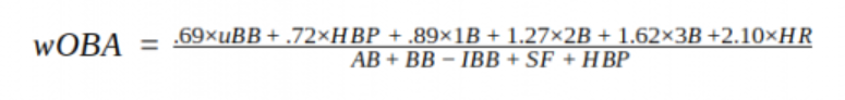
Figure 1: wOBA or weighted on-base average is measuring a hitter’s overall offensive value, based on the relative values of each distinct offensive event. Weight is applied to different outcomes based on the value of that outcome
Environmental, Health, and Safety (EHS) is experiencing a lot of the same growing pains that baseball fans are faced with in the sabermetrics revolution. On the positive side more data is available for analysis and more data will ultimately help us to progress in the right direction by refining our insights. The problem is that if we use the “data will speak for itself” approach we will be left with a lot of confused people trying to understand what is good? With more data comes more responsibility. If care is not taken to communicate the information properly, we may lead individuals to come to incorrect conclusions, or just check out from the analytics process all together reverting back to old ways of doing business.
Data visualization plays a huge role in helping turn our data analytics efforts on the back end into consumable and understandable insights for front-end users. In his book “The Truthful Art”, Alberto Cairo discussed five key qualities to an effective data visualization. For our purposes we will dive deeply into three of the five. For data to be communicated effectively data visualizations should be truthful, functional, and insightful.
1. Data needs to be truthful.
First and foremost, as analysts, we are the keepers of the data. Therefore, it is important that we are truthful with the data. This means that after understanding what metrics we are attempting to communicate, we do so in an honest and unbiased way. EHS metrics are usually a function of the greater production environment. Meaning that, if we were trying to assess the growth of a behavior-based safety program, we would want to look at the growth of that program as a function of the change in the production environment. For example, when reviewing inspection data, we cannot look at these numbers in a silo. Doing so could bias our metrics. Inspections might have increased 10%, but if the number of employees increased by 30%, is the inspection program really growing at the rate we would expect or is it losing momentum? If we wanted to deceive ourselves, we could simply include the first number and report a 10% increase in inspection volume. Since EHS is a function of production, the data is usually more truthful if we report metrics in rate and ratios of production or employee headcount. Additionally, many organizations experience seasonality in production, which can play a big role in the truthful communication of our data. Every production unit, employee, project, and hour are an opportunity. Communicating EHS metrics as a ratio of number of opportunities tends to remove bias and increase the truthfulness of our metrics. However, truthful data is not useful if the visualization is not functional.
2. Data needs to be functional.
For data to be interpretable a data visualization needs to be functional. I once worked for a company that had so many acronyms, that they had an acronym dictionary that was more than five pages long. Anytime there was a national call for EHS or operations it seemed like every other word was an acronym. This really hindered my ability to digest the information as I felt like I was constantly on an easter egg hunt for meaning in the acronym dictionary. When our visualization tools are beyond the comprehension of our end user, the functionality of the data visualization is lost along with the interpretation of the information. After all, data visualization is for the end user, not for analysts to show how cool they can make things look. When planning out our data visualization we should keep our end user in mind and ask how familiar they are with graphics and dashboards. An executive team that is used to reviewing dashboards might be able to handle more complex concepts such as scatterplots. On the other hand, dashboards to be sent to front-line supervisors might need to be more consumable in a quick glance with more straight forward graphics like bar charts and line graphs.
Less is more. Often, I run across data visualizations that have 10, 15, or even 20 graphics on them. Talk about sensory overload. As you scroll down the dashboard you feel like a ping pong ball being bounced from metric to metric with an endless onslaught of color, titles, and numbers. Before creating a data visualization take some time to understand the purpose of the dashboard. This will help you build parameters around the information and number of graphics to be included. Multiple dashboards with different specific purposes help users better digest information more quickly and avoid sensory overload. Functional dashboards help build insightful dashboards.
3. Data needs to be insightful.
The last, but not least, key to data visualization is making your dashboard insightful. This plays off the functional visualization key but goes further. When we discussed functional visualizations, we focused on the end user interpretability. That plays a role in making a visualization insightful. However, an insightful visualization shows you something you did not know. If we want people to embrace data analytics in EHS, we need to show the value. A great way of doing this is by making sure that the information is insightful. A common metric in EHS is the number of OSHA recordables experienced year to date. This might be insightful for a key performance indicator that is being tracked but our visualizations should show more than this. A visualization with static metrics does not provide the needed insight to make data driven decisions. To make this metric insightful we could show OSHA recordable trends by days of the week or months. Moreover, we could break that information down further and show concurrent trends by department, cause, objects involved in incidents, time of day, etc. All this additional trending information helps to tell a story as to where we are. This higher level of insight will help us better focus our efforts more proactively for intervention and provide more value to the visualization. Insightful visualizations show the teams something that they did not know and helps provide context for taking action.
“Let the data speak for itself.”
This is a misguided phrase that assumes that every end user of the data has x-ray vision into the inputs and the thought process behind the data delivery. As analysts, we need to speak for the data. This means putting together meaningful data visualizations that are truthful, functional, and insightful. Keeping these three characteristics of a data visualization in mind will ensure that we are communicating digestible information that increases the appetite for data driven decisions, ultimately fueling the value of EHS analytics, and helping us all eliminate death on the job.
Looking for a reprint of this article?
From high-res PDFs to custom plaques, order your copy today!