How to effectively use safety signage
Avoid sensory overload
Signage is often posted to make everyone aware of a hazard, but when signage is overwhelming, unclear, vague, improperly placed or poorly maintained it’s true purpose can become minimized or defeated.
Required signage
OSHA requires specific types of signs:
DANGER signs indicate an immediate hazard that could cause death or severe injury and the worker must take precautions must be taken to avoid the hazard. The sign must be red with white letters.
WARNING signs indicate that the hazard could result in serious injury or death. The sign must be orange with black letters.
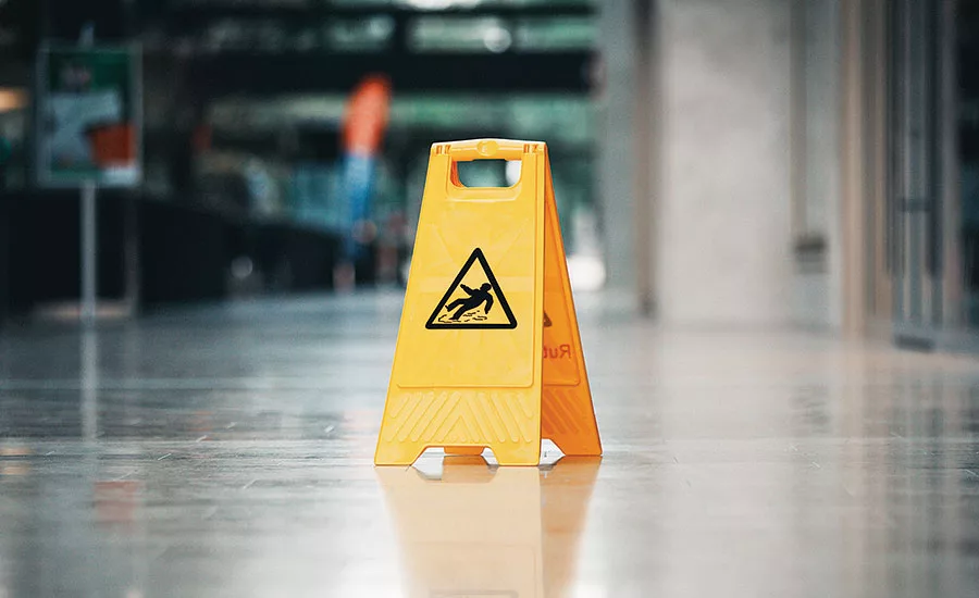
CAUTION signs indicate that a hazard may result in minor to moderate injuries and to warn against unsafe actions. The sign must be yellow with black letters.
NOTICE signs provide general information. These signs are blue with white letters. Green signs with white letters are used for general safety messages.
Changing behavior
Some people view signage as “due diligence,” and post signs everywhere, but having too many signs in a workplace is overwhelming and can be counterproductive. Even though most workplaces don’t resemble Times Square, putting too many signs in a single area can cause the same problems. Employees could ignore signage for more severe hazards, ignore all of the signage because it’s just too much to take in at one time, or simply not really see a specific sign because something else caught their attention.
Appropriate messaging
A sign that contains too much information can be hard to understand – and easy to ignore. Signs with too much information can also be confusing for employees who don’t regularly speak the language written on the sign and for those with vision problems.
Conversely, signs that are overly vague may not completely communicate a hazard. For example, is an “overhead hazard” a rolling door that could come down, a low-hanging piece of equipment, an item that may fall, or something else? A sign that clearly expresses the hazard as well as an action that needs to be taken is more effective.
Many facilities now use pictograms in addition to text on signs to communicate hazards, which are often visible to workers from a farther distance than written text and help signs to stand out and not blend into the background.
Proper placement
Placing signs in the correct locations helps ensure that they receive the attention they need to convey hazards. Signs that are too far from a hazard aren’t effective because employees may not be able to see the hazard and therefore may not associate the sign with it. It is also easier to ignore because the hazard isn’t right in front of them.
If a sign is too close to a hazard, employees may not have enough time to assess the risk and take an appropriate action. It may be too little, too late.
Signs also need to be placed at a normal point of view. Hanging a sign too far overhead or in a location that obscure its view can make it ineffective. Placing signs in areas with low lighting can also diminish its usefulness.
Looking for a reprint of this article?
From high-res PDFs to custom plaques, order your copy today!